Above is some screenshots from my showreel, not yet fully rendered. I’m to include turntables of my models and include some of the best footage from my animation. I don’t include old models from previous years. I just feel they don’t reach the level of quality that I want to include in my showreel. It will include most of what I have modelled this year and what I will continue to create and include in my showreel after graduation.
This year I’ve been informed by a handful of the guest lectures that its most important to include your best work. That its better to have a 30 second showreel with quality work that trying to fill it out a 2 minute show reel with amateur work. I’ve also learned that its important to create dynamic, interesting poses for your models to add to the impact of the work.
As I’ve learned it important to tailor your showreel to the job that you are applying for, but as an aspiring 3D Artist and someone who will be looking to 3D Artist/Sculpting/Modelling jobs as much as I can I thought it would be best to, in the mean time, tailor my showreel quite specifically to 3D Models. Evidently the showreels I looked at were 3D Modellers, CGBros and CGMeetUp had great and professional showreels that not only presented beautiful and impressive work but also creative, interesting and frankly better ways to show off their work. Turntables are good, they’re traditional and theres nothing wrong with them but there’s also nothing wrong with having interesting and original methods of exhibiting your work. Your showreel is incredibly important and its and I thought that I could be creative with mine, you certainly want to show off your work as best as possible so I think I’ll apply some of the techniques I’ve seen in my research to my own showreel.
For my online portfolio I chose to use Art Station. Its a popular choice for most artists, its a good way to stay connected to other artists and people in the industry as well as a being an accessible and uncomplicated way to upload your art and view other artists work. It seemed like the best choice and its also been mentioned and recommended by most of the guest lecturers who have came in to speak to the class. The majority of people in the industry have an ArtStation account and its a convenient way for them to see your work or for an opportunity for me to show them.
As an aspiring 3D artist its important that I keep my portfolio specific to that. Its clear and uncomplicated, and potential employers, companies and other artists can see what I specialise and am interested in.
Portfolio Research
I did some research of how some of my favourite 3D Artists organise their online portfolios. An insight into how the more professional do it and what they include in their posts, the breakdowns, what videos might they include, and how they overall structure their posts.
I looked at a mixture of stylised and realistic digital artists, as well as artists who sculpt people, environments and props, just to see how they displayed their models and how I could adopt some of the same techniques and at least keep in mind what the finish render would and should look like for my next processes after I graduate and continue to expand my portfolio.
SketchFab
I also created a sketchfab account as a more interactive portfolio, so one could get a better look at my models, the wire frame, etc. Its a better way especially for potential employers to get a good look at my models, its means I can present them my best work and its easier to keep a clean and accessible online portfolio of my work. Rather than staring at a picture or scrubbing through a showreel they can look in greater detail at my work.
The only downside if that I can only upload one model a month, so I’ll have to upgrade to a monthly subscription, it could be a good investment or I could ultimately find a better, cheaper, perhaps free, alternative.
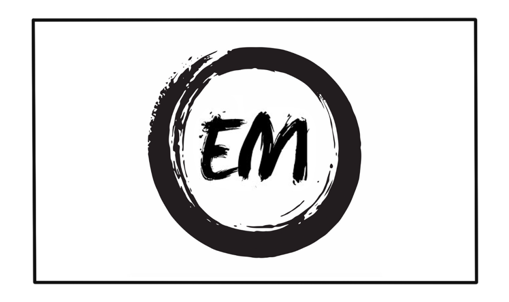
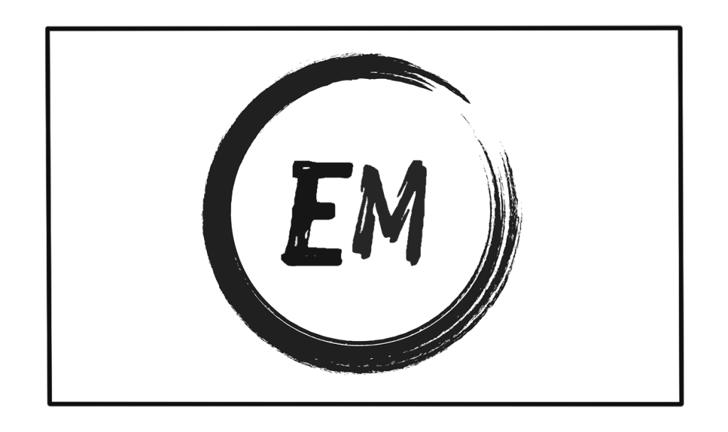
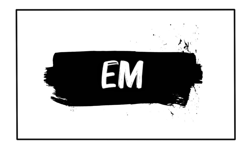
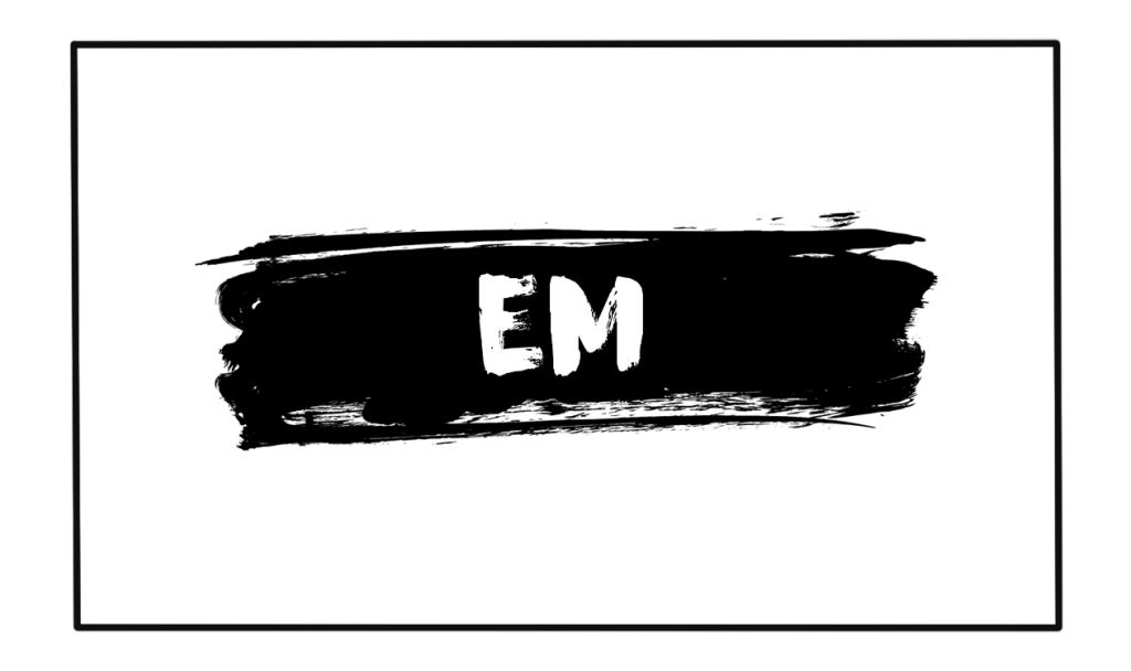
I tried some redesigns of the business cards, I looked at some examples of 3D artist business cards online to get an idea of what the most appropriate direction to go in would be. A lot of the cards I saw were quite simplistic. I thought it important to include my initials and I quite like the simplicity of the the designs I’m going for, I think its less obnoxious as a card and a little more curious which could prompt a potential employer to look at the card.
I considered using a 3D model on the card but I’ve recognised that thats perhaps a little too over done and I’ve no models in my portfolio just yet that I would be decided on putting on my card. A consideration for the future however.
I’m going to continue after graduation to work on the business cards and see if there’s a better design I can come up with, something more interesting, unique and particular to me.
Instead of sketching I thought that I’d do a 3D mock up of the layout, it would be a lot easier to be more creative and move things about as particularly, subtly or interestingly as I want to. It also means I can play around with dimensions because I was still unsure of the board sizes etc and my designated panel or position in the room is still subject to change so it means I can make alterations later on when the ‘Final Year Committee’ designates positions for the final year show.
I did a mock up of my CV. I tried my best to be artistic with the layout without being obnoxious and having it be distracting from the information. I spoke to Brian and he just suggested that I get rid of the skill bars as it can be confusing because understandably, how can one know how good they are at a particular software. He also suggested that I tailor my “profile” section to make it a little more personal to me and more of an insight into what direction I am particularly keen in going.
Also get rid of the profile pic because having all my contact info and a picture of my face is dumb and in hindsight I totally agree.
After the feedback I had from the Illustrating tutor from the University who kindly came in to give us helpful critique on our creative futures work, she informed me that my business cards were a bit too boring and simplistic. She said that if I want to stand out then I have to do something a little more interesting. She suggested that maybe tie in my business cards with project so that when certain potential employers or other artists are looking at the card they will remember the project and who I am, sound logic, so I did a few mock ups, trying my best to be subtle with the guns etc. I have some ideas and its another consideration. I can show my tutors and my peers and get critique from them.
After the talk with the Illustration tutor she suggested that the colourful skies might be a bit inappropriate for the rather dark & sorrowful subject matter. So I should reconsider the skies and do something darker. I did up a few different variations and including the 2 silhouetted images of the mother and son that she preferred just for reference. I included a little contrast of light, like orange and white for instance as a metaphor or symbol of hope. We also quite spontaneously but organically came up with the title adducted which I realised I used the noun rather than the adjective in the title. I can change it later. I think I have enough concepts to consider and I feel that I’m approaching the final design. I just need a little more feedback and alteration.
For the business cards I wanted to go for something simplistic, something that would be stand outish and at least grab a persons attention. I thought that if you pulled any of the first few out of your wallet for instance you would probably be curious to see what or who it is. Merely speculation though. I’ve no scientific theory to back up this tactic.
I do believe though it might be more suited to a graphic designer or fine artist and its not tailored quite specifically enough to my “brand”, profession or description. I know now at least how it looks and that I should continue to brainstorm.
After my feedback tutorial with Henry we discussed a few ideas and he pitched a few interesting concepts that I thought would work well, like the butterflies for instance. We also agreed that the boy with his mother would be a powerful image; it could be visually intriguing and insightful into the story, so I decided to incorporate these ideas as best I could. I’m actually really happy with the outcome, I tried my best to sketch out as many different variations of the boy and his mother as I could, as well as how the butterflies could work in the frame. I tried to incorporate a lot of negative space because I wanted the sky to be prominent in the poster, the sky is as much a character in the the film as the people are. I played about with composition and silhouettes, but consciously left room for the title in each one as well. I also included different variations of colour in the sky just to see what might look best.
I did a few sketches of what I thought might be a good starting point for poster designs. Trying to include important aspects of the story in the poster and really give as much info to the viewer as possible, keeping it intriguing and interesting.
Drew Struzan
Graham Humphreys
Originally my 2 biggest influences where Humphreys & Struzan. I wanted to do something similar to this. The characters on the poster, standing in the environment, hand painted with the detailed brush strokes and interesting light, colours and palettes. I was excited to do it, probably would have taken me roughly 5 days to do and I was informed that it was too busy, too noisy. This Idea, similar to the rough sketch I did in the top right was too cluttered and too much was happening so I sacked the concept.
I considered the butterfly also but Henry recognised it was quite ‘punk’ and I agreed that if I saw the poster I would think it would be for a music gig or something so I reconsidered that idea too.